Two menu covers can use the same leatherette and the same stitching and still land very differently on the table, and the reason is almost always the logo. How your mark is applied decides whether it reads as quiet and expensive or bright and legible from across a dim room, how many colors it can carry, and how the price behaves as your order grows. There are four decoration methods that cover nearly every restaurant order, and each one suits a different combination of material, budget, and run size. Here is how they compare and how to choose.
The four ways a logo gets onto a cover
The realistic menu is short. Hot foil stamping presses heated metallic or pigment foil into the surface for a bright, reflective mark. Blind debossing stamps the logo into the material with no ink at all, leaving a recessed, tone-on-tone impression. Screen printing pushes opaque ink through a stencil for flat, solid color, one screen per color. Digital printing lays down full-color, photographic artwork directly, with no die or screen to make. Everything else you will be offered is a variation on one of these four. The trade-offs among them fall along three axes: the look, the number of colors, and how the cost scales with quantity.
Hot foil stamping: shine that needs a die
Foil stamping is the method most people picture when they think of an upscale menu. A metal die, engraved with your logo, is heated and pressed through a thin foil so the design transfers onto the cover with a crisp metallic or matte finish. The palette is broad in the sense that foils come in gold, silver, copper, black, white, and even pearl or holographic finishes, but each foil color is a separate pass, so a two-color foil logo means two dies and two hits. Foil sits well on leather, leatherette, and vinyl, and it is genuinely durable because the image is pressed into the surface rather than sitting on top of it. The catch is the one-time die. That tooling cost is charged up front and does not repeat on reorders, which is why foil rewards larger runs, as the first chart makes clear. On a short run the die dominates the price; on a big run it is a rounding error.
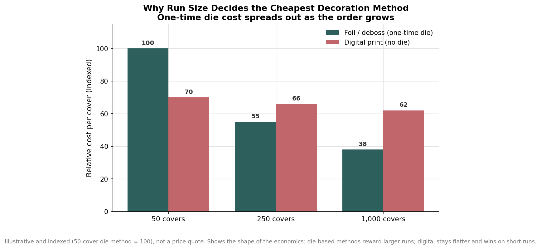
Because foil pricing typically tracks the stamped area and coverage, a compact logo stamps far more economically than a large crest that fills the front panel. If you love the metallic look but the design is big, ask whether it can be simplified or scaled down before you commit to the die.
Blind deboss and emboss: texture instead of ink
Blind debossing uses the same kind of die as foil, but with no foil loaded, so the logo is simply pressed into the material. The result is a recessed, monochromatic mark that catches light at the edges. On many leatherette and bonded materials the pressure and heat also darken the impression slightly, creating a burnished effect that looks richer than a flat print. Embossing is the same idea in reverse, raising the logo instead of recessing it. This is the most understated option, and it is a favorite for fine dining and boutique hotels precisely because it adds no color and draws no attention to itself. It shares foil’s economics: a die is required, so it makes the most sense once your run is large enough to spread that tooling cost. Because it carries no ink, it is also the most forgiving to keep clean over a cover’s life, since there is no printed layer to scuff or peel.
Screen printing and digital: color at two different scales
When the logo needs actual color, the choice narrows to screen printing and digital, and the deciding factors are how many colors you need and how the artwork looks. Screen printing lays down flat, opaque ink and is the workhorse for simple marks on vinyl and poly covers. It handles solid shapes and text cleanly and is cost-effective at volume, but it is practically limited to roughly four colors because every color needs its own screen and its own pass. Fine gradients and photographic detail are beyond it. Digital printing removes that ceiling entirely, reproducing continuous-tone, full-color artwork with gradients and photographs directly onto suitable materials, with no die or screen to make. The second chart lines up the color ceilings side by side.
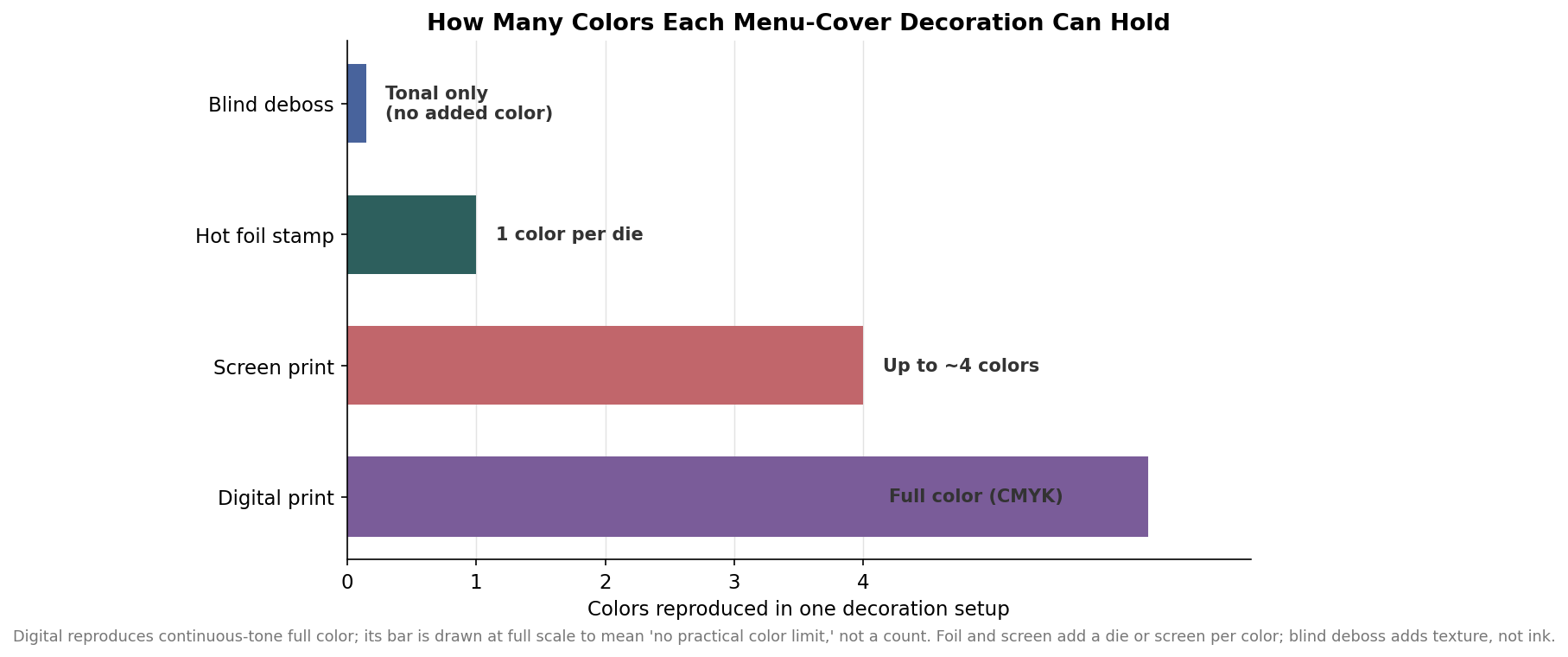
Because digital carries no tooling cost, it is the natural choice for short runs, complex logos, and covers that need more than a few colors. Screen printing tends to pull ahead on cost for large quantities of a simple, low-color mark. And neither one gives you the pressed-in tactile quality of foil or deboss, which is a look, not just a color.
Matching method to material, budget, and run size
Start with the material, because it quietly rules some methods out. Foil and deboss want leather, leatherette, or a quality bonded surface that takes a clean impression. Screen printing and digital are happiest on vinyl, poly, and plastic covers built for ink. Next, weigh the look you want against your color count: choose deboss for the most restrained, tone-on-tone impression, foil for metallic impact in one or two colors, screen printing for a few flat colors on a plastic cover, and digital when the logo is full-color or photographic. Finally, let run size settle the economics. A one-time die on foil or deboss is a poor trade for fifty covers and an easy one for a thousand, while digital’s lack of tooling makes it the safer pick for small or first-time orders where you are still refining the design.
Two practical notes before you order. Ask for a physical proof or a stamped sample whenever a die is involved, because a logo that looks fine on screen can lose fine lines when it is engraved and pressed. Lead times for decorated covers commonly run in the range of one to three weeks from approved artwork depending on method, quantity, and whether tooling has to be cut, and that window is indicative rather than a fixed promise. Get the method right for your material, your palette, and your volume, and the cover does exactly what it should: it carries your name the way you want it read.